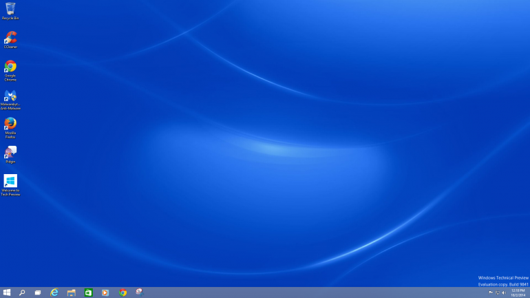
Windows 10 feels like what Windows 8 should have been from the beginning -- it’s less revolution, more evolution.
On Sept. 30, Microsoft officially unveiled its new operating system, Windows 10. It isn't named Windows 9 for myriad reasons, one of which is Microsoft's effort to distance the new moniker from the often lambasted Windows 8.
Although it’s not set for official consumer release until
2015, there is a beta of sorts available. So the question is, how good
is Windows 10 right now?
Keep in mind that, like any developmental software, Windows
10 isn’t final, but as it stands, the experience is, for the most part,
positive.
1. The good
The new Windows 10 desktop is familiar; it looks like
Windows 7 or Windows 8.1 in desktop mode. But massive changes for the
sake of change aren’t always necessary (remember the original Windows 8
launch? Precisely). It looks like Microsoft took the sensibility of
Windows 7 and threw some Windows 8.1 DNA into the mixture.
The old Start menu is back (and you no longer have to click
a live tile to get to it, huzzah!), but it now contains rearrangeable,
customizable live tiles. It breathes some life into an otherwise stale
Microsoft design staple. If you prefer the 8.1 Start Screen, you can
switch back to that (though why you’d want to on anything except a touch
device is beyond me) with a few setting changes.
One of the more subtle improvements is the inclusion of
multiple desktops. It’s a simple but clever organizational solution,
whether you work on one or multiple screens: It allows you to hide and
shuffle windows and workstations as desired, so you won’t have to sift
through 20 open tabs in Google Chrome to find your work email sandwiched
between open YouTube and Facebook tabs. If you’ve got multiple monitors
hooked in, it feels almost like you’ve got two separate computers at
your station, and it eliminates the need to manually manage each new
program you open on a main screen -- wherever you want it, open it there
and you’re set.
The most appealing new feature (as an avid gamer) is Windows 10’s integration with Xbox.
Xbox is launched as its own live tile and lets you plug your gamercard
in, and it holds your games library -- just like the Xbox One and Xbox
360 do, off-computer. What this means is that the original Xbox browser
website can be completely bypassed if you want to check on your game
stats. That’s a great thing, because the current Xbox.com has been slow,
sloppy and frustratingly buggy for years. Nobody will miss it. How this
all translates to the Xbox One itself is still unknown, but this is
promising.
One last note, albeit a small one: Cortana is a part of Windows 10. There are system files containing the name of Microsoft’s resident A.I./Siri competitor, and although the technical demo doesn’t hold a use
(at least, not one I found) for the files, this is pretty convincing
evidence that Cortana will be in the final version of Windows 10.
The bad
Well, it isn’t all-new, if that’s what you’re looking for.
Stripped of the live tiles and subtle facial changes, it looks just like
the desktop mode of Windows 8.1, which looked like Windows 7, which
looked like Windows Vista.
As previously mentioned, the Windows 8-style home is also
available if you so choose. But right now it just feels like it was
tacked on in an attempt to appeal to everyone. It has some unforgivable
flaws at the moment. The biggest problem is that if you open something
in the Windows 8 home screen, it still opens in the classic desktop mode
-- and it doesn’t revert when you close the program either, so you have
to go back to the Windows 8 home style manually. The inclusion of the
Windows 8 style seems like a total afterthought.
Which is fine, because it doesn't deserve a place in the
final build. All it’s doing is cluttering the classic desktop, and
Microsoft is well aware that consumers aren’t big on Windows 8 desktops
and laptops anyway.
When you open the live tiles, you’re presented with the
Windows 8 touch screen, swipe side-to-side navigation method. It just
looks weird on a non-touch device, and scrolling horizontally is
counterintuitive with a mouse. If Microsoft reworked these programs to
scroll vertically (like a Web browser), they’d make more sense.
3. Verdict
It’s still early in the development cycle and Microsoft is
adamant that this isn’t close to the final product. There are a lot of
good ideas here, but it’s clear that there’s still work to do --
hopefully Microsoft is actually listening to feedback intently.
If you’d like to try it for yourself, here’s the link.


No comments:
Post a Comment